
Well now, hasn’t it been a while?
But what better time to throw some blogging out into the world than during lockdown…
Last weekend I decided to get my cyanotype on, and experiment with cyanotyping.
The idea came from someone I’m following on Instagram, who recently posted a stunning shot of a cyanotyped quilt, complete with delicate leaf shadows.
I’ve actually played with cyanotyping before- last Christmas I bought some ready-made cyanotype paper and experimented with floral patterns under the glaring Australian sun. But I had no idea that you could cyanotype fabric.
(Sure, social media can be a black time-sucking vortex of doom and bigotry. But it can also be an amazing mixing ground for individual creators to share their brilliance.)
Anyway, cyanotyping is an oldish technique, having been developed by the English polymath Sir John Herschel back in 1842. Herschel was a mathematician, astronomer, chemist and photographer. Plus, via his intention of cyanotyping, he also became the inventor of blueprints.
Cyanotyping involves first mixing potassium ferricyanide with ferric ammonium citrate.
I bought the two online as a cyanotyping kit. They come as powders, but all you have to do is add water to the bottles to make solutions (the manufacturers recommend waiting 24 hours to let everything dissolve properly), which can then be stored fairly long-term.

To start the cyanotyping, you need to mix the two solutions (in this case, in equal volumes), paint them on your surface, and let it all dry.
If I’m completely honest, I did the standard Tegan thing of not waiting exactly long enough. It still worked with slightly-damp cloth, but there was some condensation involved.
By the way, once you start mixing, the solution is photosensitive, so the painting and the drying should be done- as much as possible- in the dark. Again, I did this in the kitchen during daylight hours (no direct sun, but a lot of ambient light), and then let it ‘dry’ in the very-dark garage. It seemed to go down fine.
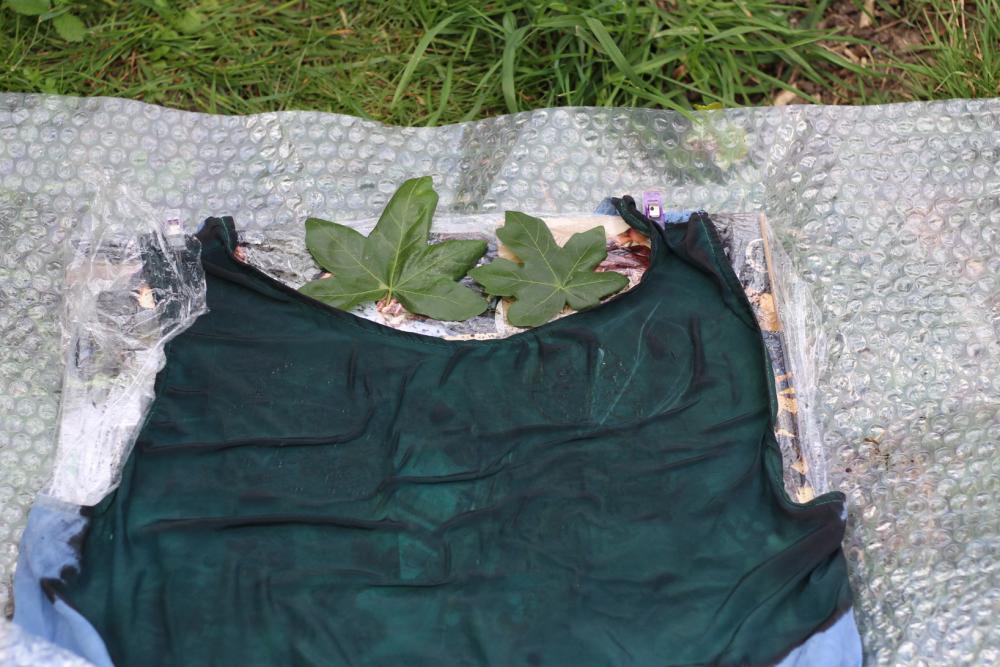
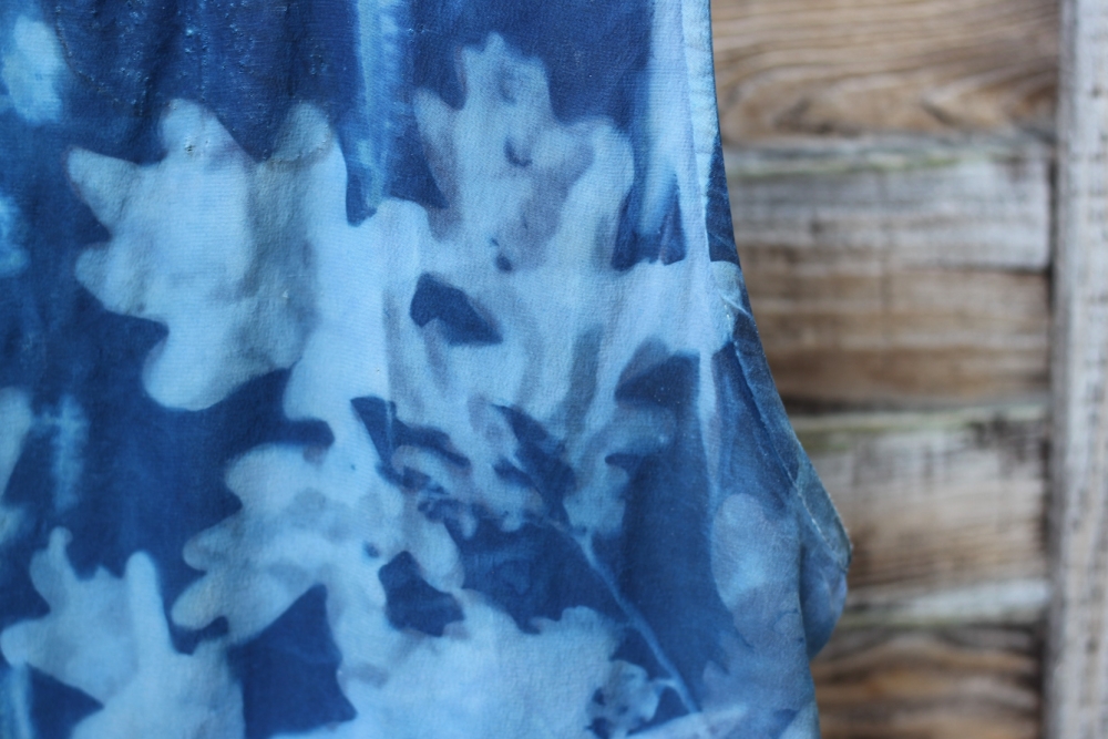
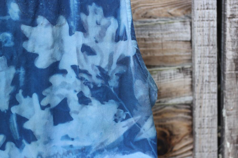
Then you choose your contrasting objects. It was always going to be plants for me, but after a certain amount of humming and hawing, oak leaves won out over some more ferny-looking fellows.
I used some glass over the leaves to keep everything in position. It was a kind of windy day.

And then, you put it into the sun! At this point, the UV light and the citrate reduce the iron (III) to iron(II), the iron(II) reacts with ferricyanide and an insoluble blue ferric ferrocyanide is created.
How dark the blue comes out depends on the UV light. As you can see from the above photo, pretty much the second I put my cyanotype outside the UK decided to be all UK-y and the sun disappeared long-term behind some clouds.
The sun eventually returned, but all up I exposed my cyanotype 45-50 minutes, while the bottle suggested 10-20.

When I first removed the leaves I was a little disappointed by the result. Sure, there were patterns. But they didn’t look particularly defined or oaky.

With an ‘oh well, it’s a first try’ kind of attitude, I continued with the rinsing- which removes the unreacted solutions and ions, while keeping the insoluble Prussian blue clinging on.


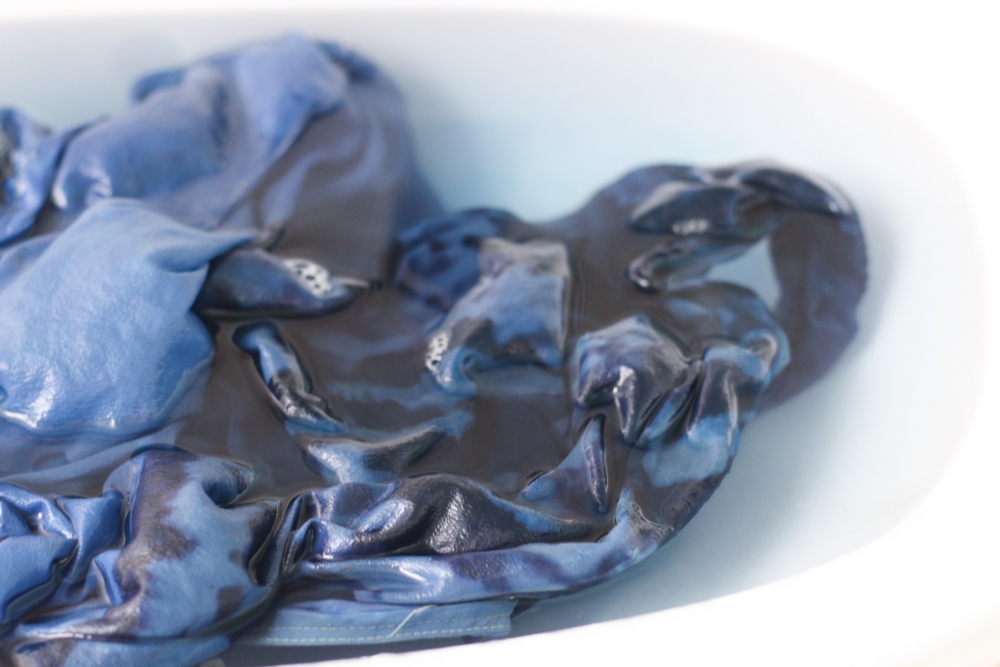
Rinse until clear, and then dry to develop further.
Apparently there’s a shortcut which involves adding some peroxide, but I didn’t happen to have any of that hanging around.


Comparing the above (wet) with the below (dry) photo nicely shows how the contrast sharpens!

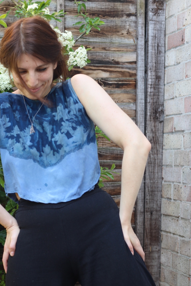
Ok, time for some shots on-body.


Can you tell that my camera remote is currently out of batteries and I had to use the timer setting? A good percentage of the photos had me out of shot, out of focus, or both.
I also want to point out that this pretty bush is VERY VERY prickly.
Sure, I’m pretending to love it:

But the little fellow was actually making repeated attempt at my life, and the life of my soft silky top.

Ok, so my overall thoughts.
Well, you can see that there are a couple of issues with the dyeing. Which, clearly, 100% on me and not on the process itself. I’m particularly irked by the fact that I managed to get a couple of drops of the dye on the bottom of the shirt (you can see them in the final shot of the post). I’ll do a little research to see if application of some nice strong-phosphate soap and a bit of scrubbing can remove it (cyanotyped fabric needs a non-phosphate soap wash), but it’s possible that this will just make the spot go kind of yellow-y. Also, the fabric is a very soft silk that has already been pre-dyed by myself, so it’s not a great candidate for being scrubbed.

You can also see that there is some weird lack-of-dye up there on the right hand corner, and some slightly off patterning in the centre. I’m not completely angry at this- it kind of works fine with the rustic-hippie style. But yeah, this one is because I didn’t let the material dry properly and because it wasn’t lying particularly flat when I put it in the sun. Creases in the fabric lead to creases in the dye job.

Finally, I was really hoping that the edging would be a ‘hard fade’ to the pale colour. I tried to make this happen by layering a few leaves over the top of the dye edge, and then having the oak-leaf shapes merge into these layers. I think it would be necessary to both make an effort to remove the excess of dye at the edge (try patting it before it dries) as well as having a few more layers of something completely opaque to stop any colour appearance.
Again, I’m not completely angry with patterning I ended up with, but it was not entirely as I planned.


So, all in all I’m pretty pleased with the result, and enjoyed the process a lot.
In the future, I want to try playing around a bit with the colouring. It’s supposed to be possible to either tone down or tone up the blue, but also to change the colour tone towards a more purple-grey or kind of mustard. To do this, tannic acid, oolong tea or wine can be used. Also cat urine apparently, but I think I might stay away from that one.
17 Comments